This theme comes with different module styles, badges and icons. For each module you can pick a style and combine it with an icon or badge to create your own unique look. Here is a list of the available options:
| Styles | mod-color, mod-dark, mod-white |
| Badges | badge-hot, badge-new, badge-free, badge-top |
| Icons | icon-bookmark, icon-twitter, icon-envelope, icon-comment, icon-lock, icon-shopping-cart. See more icon options here |
Each position has its own layout. You can align module layouts side-by-side, stack them or choose your own grid layout. The grid adapts perfectly to your layout even on smaller devices.


You can create some beautiful content by using some simple HTML elements. abana theme offers some neat styles for all HTML elements and a great set of CSS classes to style your content. Basic HTML is very easy to learn and this small guide shows you how to use all styles using rokCandy shortcodes.
Basic HTML Elements
Here is a short demonstration of text-level semanticts. The <p> element creates a new paragraph. It will have some space before and after itself. To turn your text into hypertext just use the <a> element.
This is an H1 Heading
This is an H2 Heading
This is an H3 Heading
This is an H4 Heading
This is an H5 Heading
This is an H6 Heading
H1 with a dotted line
H2 with a dotted line
H3 with a dotted line
H4 with a dotted line
H5 with a dotted line
H6 with a dotted line
Text-level semantics
You can emphasize text using the <em> element or to imply any extra importance the <strong> element. Highlight text with no semantic meaning using the [mark] element[/mark]. Markup document changes like inserted or deleted text with the [ or [del] element[/del]ins] element [/ins]. To define an abbreviation use the [abbr] element [/abbr] and to define a definition term use the [dfn] element [/dfn].
Lists
You can create an unordered list using the [list]. The li element defines the list item.
Simple List
- List Item 1
- List Item 2
- List Item 3
[list]
   [li]List Item 1[/li]
   [li]List Item 2[/li]
   [li]List Item 3[/li]
[/list]
You can create lists with different style variations. E.g Lists with alternative stripes, lists with icons etc.
Lists with stripes
- List Item 1
- List Item 2
- List Item 3
[list style="uk-list-striped"]
   [li]List Item 1[/li]
   [li]List Item 2[/li]
   [li]List Item 3[/li]
[/list]
Lists with icons
Adding icons to your list, makes them even look more outstanding. Check out the entire collection of icon fonts that you can use with lists here
[list style="list-icons"]
   [li icon="icon-asterisk"]List Item 1[/li]
   [li icon="icon-asterisk"]List Item 2[/li]
   [li icon="icon-asterisk"]List Item 3[/li]
[/list]
Nested Lists
[list style="list-icons"]
   [li icon="icon-asterisk"]List Item 1[/li]
   [li icon="icon-asterisk"]List Item 2[/li]
      [nested_list]
         [li icon="icon-asterisk"]Child Item 1[/li]
         [li icon="icon-asterisk"]Child Item 2[/li]
      [/nested_list]
   [li icon="icon-asterisk"]List Item 3[/li]
[/list]
Quotations and Code
Inline quotations can be defined by using the <q> element
.
The blockquote element defines a long quotation which also creates a new block by inserting white space before and after the blockquote element. This is an emphasis within the blockquote
To use the blockquote style create a paragraph in the following format
[blockquote author="name"]some content here [/blockquote]
To define a short inline computer code use the <code> element. For a larger code snippet use the <pre> element which defines preformatted text. It creates a new text block which preserves both spaces and line breaks.
pre {
    margin: 15px 0;
    padding: 10px;
    font-family: "Courier New", Courier, monospace;
    font-size: 12px;
    line-height: 18px;
    white-space: pre-wrap;
}
Use the <small> element for side comments and small print.
Block Numbers and Events
1 Tempor invidunt ut labore et dolore magna aliquyam erat, sed diam voluptua. At vero eos et accusam et justo duo dolores et ea rebum.
2 Tempor invidunt ut labore et dolore magna aliquyam erat, sed diam voluptua. At vero eos et accusam et justo duo dolores et ea rebum.
3 Tempor invidunt ut labore et dolore magna aliquyam erat, sed diam voluptua. At vero eos et accusam et justo duo dolores et ea rebum.
03:dec
Tempor invidunt ut labore et dolore magna aliquyam erat, sed diam voluptua. At vero eos et accusam et justo duo dolores et ea rebum.12:apr
Tempor invidunt ut labore et dolore magna aliquyam erat, sed diam voluptua. At vero eos et accusam et justo duo dolores et ea rebum.30:may
Tempor invidunt ut labore et dolore magna aliquyam erat, sed diam voluptua. At vero eos et accusam et justo duo dolores et ea rebum.To use the block number style create a paragraph in the following format
[block-number]{number}[/block-number]
To use the event-time block style create a paragraph in the following format
[event 03:dec] your description here[/event]
Useful CSS Classes
Here is a short demonstration of all style related CSS classes included in this theme.
Highlight Content
Drop caps are the first letter of a paragraph which are displayed bigger than the rest of the text. You can create a drop cap using the CSS class dropcap. To emphasize text with some small boxes use <em> element with the CSS class box.
box info]...[/box].box warning]...[/box].box hint]...[/box].box download]...[/box].Use the CSS class dotted to create a dotted horizontal rule.
Tables
Create a zebra stripped table using using the CSS class zebra.
| Table Heading | Table Heading | Table Heading |
|---|---|---|
| Table Footer | Table Footer | Table Footer |
| Table Data | Table Data | Data Centered |
| Data Bold | Table Data | Data Centered |
| Table Data | Table Data | Data Centered |
Definition Lists
Create a nice looking definition list separated with a line by using the CSS class separator.
- Definition List
- A definition list is a list of terms and corresponding definitions. To create a definition list use the <dl> element in conjunction with <dt> to define the definition term and <dd> to define the definition description.
- Definition Term
- This is a definition description.
- Definition Term
- This is a definition description.
- This is another definition description.
CSS3 Tags
Blog Tags are used to highlight keywords or search words in a blog or site content. These tags have been designed with pure CSS3 and additional fallback for older browsers. Need more styles? Get them here
Joomla Wordpress html envato themeforest codecanyon html5 css3
To use the CSS tags in your content use the following format:
[tagurl="{url}"]{your tag}[/tag]
Toggles
Toggles are a nice way to minimize hidden sections on a page by only showing titles of the hidden text while maximizing on space. This allows the user to only view what he/she is interested in with a sleek slide down/up of the hidden content. A good example on how to use them is FAQs.
closed toggle
[togglestate="" title="your title"]your hidden text here[/toggle]
open toggle
[togglestate="open" title="your title"]your hidden text here[/toggle]
Buttons
Normal Button
normal default This is an expandable button
To use the buttons in your content use the following format:
[buttonhref="#"]button text[/button]
Color Button
normal default This is an expandable button
To use the buttons in your content use the following format:
[button colorhref="#"]button text[/button]
Forms
Create a clearly arranged form layout with fieldset boxes using the CSS class box.
Despre Noi
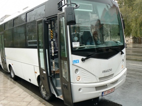
Transportul public este una dintre modalitatile cele mai simple si mai accesibile pentru a calatori in municipiul Braila
Pana nu demult, accesibilitatea si siguranta erau cele mai importante doua elemente care defineau serviciul oferit de S.C. Braicar S.A. Braila Astazi i s-a mai adaugat o alta valoare capabila si dea o alta dimensiune unui serviciu public social, aceea de modernitate concretizata prin punctualitate, confort si eficienta economica. Facilitatile oferite calatorilor sunt superioare si tin de posibilitatea de a alege orice destinatie gratie legaturilor foarte bune si accesibilitatii acestora, de frecventa curselor, de serviciile puse la dispozitia calatorilor, de usurinta obtinerii informatiilor necesare. Apropierea de calator si crearea conditiilor pentru satisfacerea nevoilor sale sunt principiile pe baza carora este permanent adaptata politica societatii in ceea ce priveste oferta de transport. In acest sens, operatorii dispeceratului central sunt disponibili 24 de ore, 7 zile pe saptamana, pentru a raspunde la intrebari de transport - apeland 0372911990.
S.C.Braicar S.A. cu sediul in Braila Bd. Independentei Nr. 10 are ca obiect principal de activitate transportul urban, suburban si metropolitan de calatori (CAEN: 4931). Societatea dipune de mijloace de transport in comun care indeplinesc cerintele legale in domeniu.
Cel mai important obiectiv al nostru este de a asigura calatorilor orasului Braila un transport public de persoane civilizat, la cote europene.
The Widgetkit Lightbox allows you to view images, HTML and multi-media content on a dark dimmed overlay without having to leave the current page.
Features at a glance
Examples
Different animations - fade, elastic and none
<a data-lightbox="transitionIn:fade; transitionOut:fade;" href="/new/images/demo/sample_big.jpg"><img src="/new/images/demo/sample.jpg" alt="fade" width="250" height="165" /></a>
Different title positions- float and over
<a data-lightbox="transitionIn:elastic; transitionOut:elastic; titlePosition:float;" href="/new/images/demo/sample_big.jpg" title="Lorem Ipsum is simply dummy text of the printing and typesetting industry"><img src="/new/images/demo/sample.jpg" alt="fade" width="250" height="165" /></a>
You can use it in a gallery
<a data-lightbox="transitionIn:elastic; transitionOut:elastic; titlePosition:float; group:gallery1" href="/new/images/demo/sample_big.jpg" title="Lorem Ipsum is simply dummy text of the printing and typesetting industry"><img src="/new/images/demo/sample.jpg" alt="fade" width="250" height="165" /></a>
Various examples in one gallery (try also using the keyboard and mouse scroll wheel)
Load Widgets In A Lightbox
Use #wk-ID to load widgets like slideshows or galleries in a lightbox. For example: Widgetkit Slideshow
<a data-lightbox="width:945;height:637;" href="#wk-2">Lightbox</a>
How to use
Use the HTML5 custom data attribute data-lightbox to activate the lightbox. You can set various lightbox parameters to the data attribute. For example:
<a data-lightbox="width:1000;height:600;" href="http://www.wikipedia.org">Lightbox</a>Here is a list of the most common parameters:
Reveal Lightbox
Use the [modal_box] shortcode to show a popup box with overlay. The [modal_box] shortcode can also be linked with these module positions: reveal-a, reveal-b and reveal-c. By using one of these positions as your target, the modal box will show a popup of the modules that have be placed in these positions and assigned to the corresponding menu.
| target | Description |
|---|---|
reveal-a |
show modal box for modules in reveal-a position |
reveal-b |
show modal box for modules in reveal-b position |
reveal-c |
show modal box for modules in reveal-c position |
For each module linked to reveal-a, reveal-b or reveal-c, you can use Module Class Suffix to style it just like a normal module. The target parameter can also be the id of a content section.
Size modifier
To adjust the size (width) of the modal box, add modal-small or modal-large to the Module Class Suffix of the module.
Trigger a modal box from link
reveal-a reveal-b reveal-c
[modal_box link target="reveal-a"]reveal-a[/modal_box]
[modal_box link target="reveal-b"]reveal-b[/modal_box]
[modal_box link target="reveal-c"]reveal-c[/modal_box]
Toggle modal box from buttons
reveal-a reveal-b reveal-c
[modal_box button style="color" target="reveal-a"]reveal-a[/modal_box]
[modal_box button style="color" target="reveal-b"]reveal-b[/modal_box]
[modal_box button style="color" target="reveal-c"]reveal-c[/modal_box]
Toggle modal box for inline content
The [modal_box] shortcode can also be used for inline content by using the following sytnax:
<!-- create a link that will trigger the pop-up modal box -->
[modal_box link target="mycontent"]my link[/modal_box]

<!-- create the content of the modal box -->
[modal_box content target="mycontent" style="mod-color"]
...
[/modal_box]
Popup content
The Widgetkit Slideshow is the ultimate image and content slideshow for Joomla and WordPress. It's flexible, easy to customize and completely build with HTML5 and CSS3.
Features
Slideshow Example
This is an image slideshow with eye-catching transition effects.
How to use
The Widgetkit Slideshow takes full advantage of the very user-friendly Widgetkit administration user interface. It has never been easier to create and manage all the slideshows and their different slides in one place. After you created a slideshow you can load it anywhere in your theme using shortcodes or the universal Widgetkit Joomla module or WordPress widget.
The Widgetkit Spotlight allows you to add an overlay to your images which fades or moves in on mouse hover. The overlay can be an image or HTML content. The default magnifier spotlight is a perfect match to be used with a lightbox.
Features
Examples
If no custom overlay is set the default spotlight fades in an overlay with an magnifier image. If you define a custom overlay you can choose between different animations - fade, bottom, top, right and left.
How to use
Use the HTML5 custom data attribute data-spotlight to activate the spotlight.
<a data-spotlight="on" href="/mypage.html">
  <img src="/image.jpg" width="180" height="120" alt="" />
</a>
To create a custom overlay use a div element with the CSS class overlay. You can set the effect parameter to the data attribute. For example:
<a data-spotlight="effect:bottom;" href="/mypage.html">
  <img src="/image.jpg" width="180" height="120" alt="" />
  <span class="overlay">Custom Overlay</span>
</a>
You can set the effect parameter to fade, bottom, top, right and left.


